The homepage of the Oasis Theme demo has been built using several blocks. Some are default WordPress blocks and some have been added through the Atomic Blocks plugin.
In this article:
- One-Click Theme Setup (used to duplicate the demo’s homepage content, if desired)
- Homepage Sections
Homepage Blocks Overview
One-Click Theme Setup
When you activate the theme, you’ll be given the option to install the starter pack of your choice. A starter pack is a bundle of content (like pages and menus) and plugins that will be automatically imported and set up for you. This feature makes it easy to duplicate the demo’s content so you can customize it for your site.
During this process, a new page named Homepage will be automatically created and assigned as the static homepage on your site. If you already have a static homepage assigned, your original page will not be overwritten, but it will be automatically unassigned as the static homepage.
If you don’t wish to use the one-click theme setup feature, you may use any blocks you’d like to build your own homepage.
See the One-Click Theme Setup page for details about using the one-click setup feature.
Homepage Sections
Here is where we’ll cover the basic settings of each Block/Section of the Homepage so you can see exactly how everything is setup.
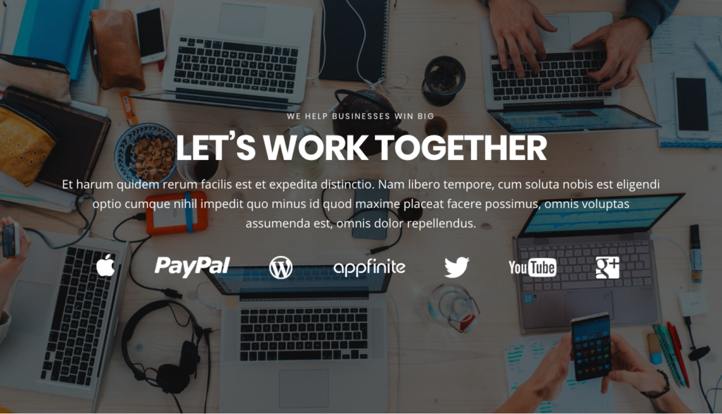
Homepage Section 1
The following blocks are used in this section of the Oasis Theme demo:
- AB Container
- Heading Block
- Paragraph Block

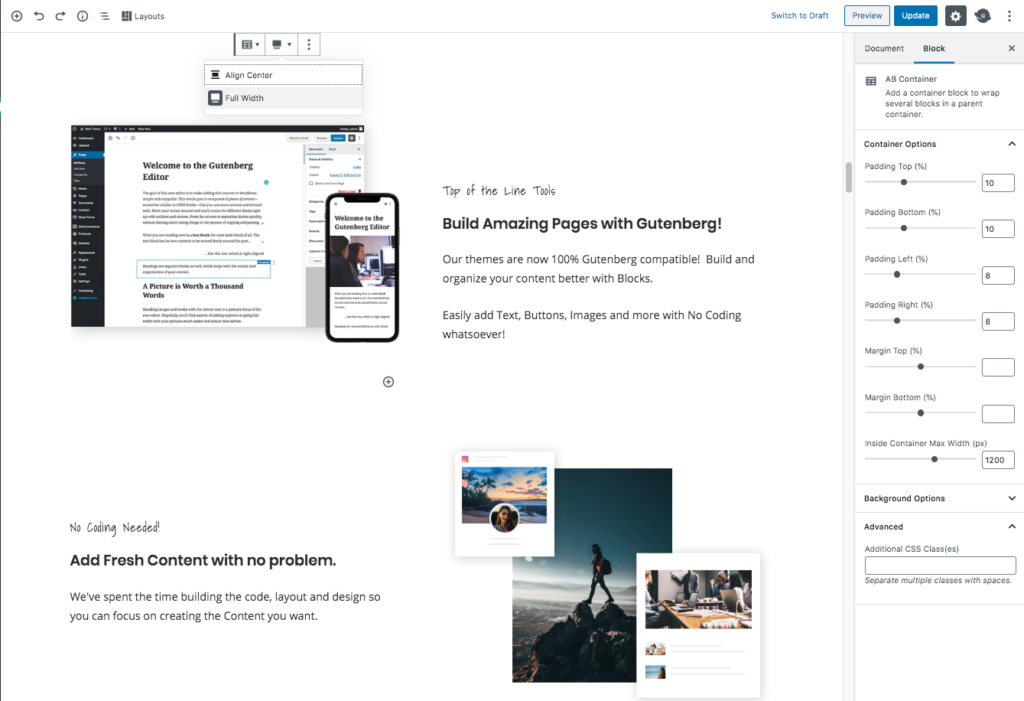
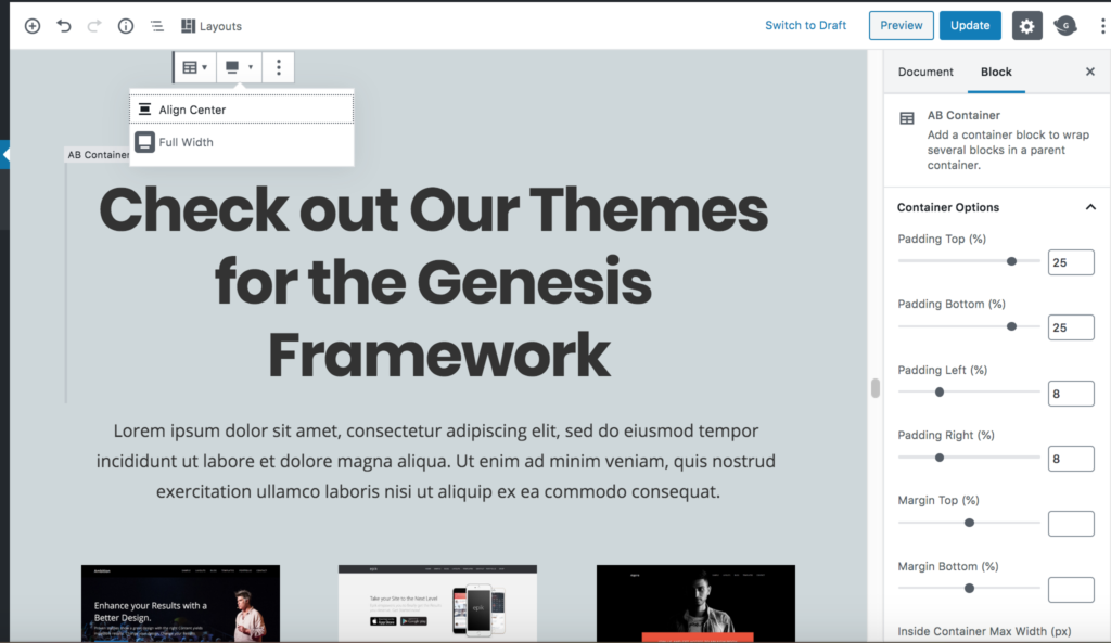
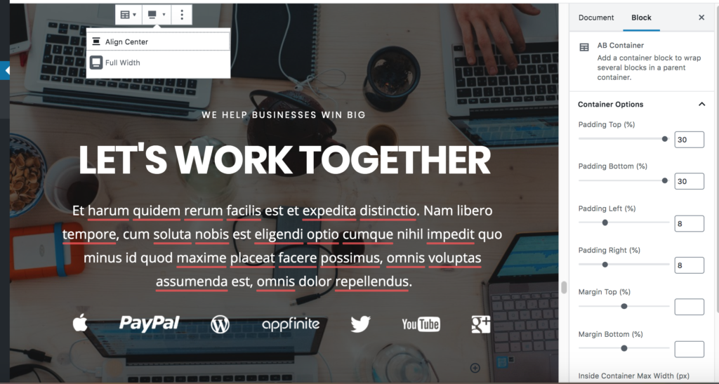
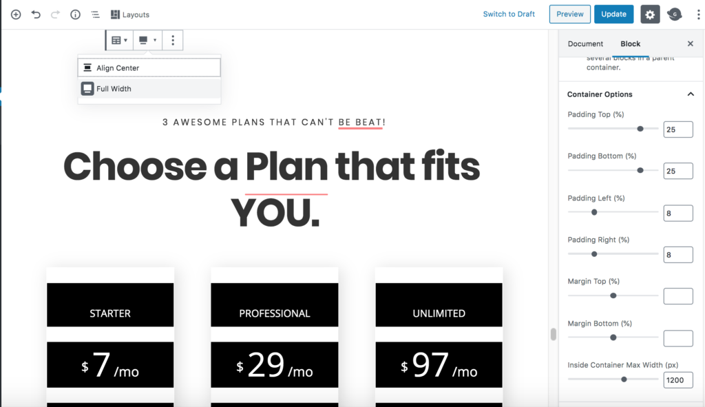
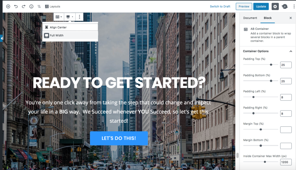
AB Container Block
- Select the Full Width option in the Tool Bar.
- Container Options
- Padding Top: 25
- Padding Bottom: 25
- Padding Left: 8
- Padding Right: 8
- Margin Top: 0
- Margin Bottom: 0
- Inside Container Max Width: 1200
- Background Options
- Image: Click Select Image to change the background image currently being used or Remove to completely remove the background image and just use a solid background color.
- Image Opacity: 50
- Background Color: #000000 (Click the Custom Color link to apply this setting.)
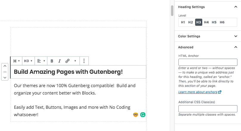
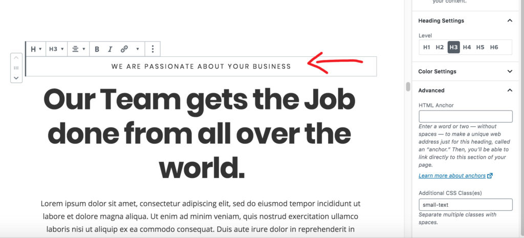
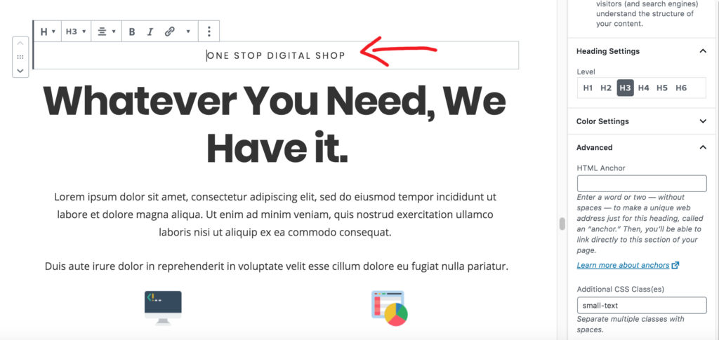
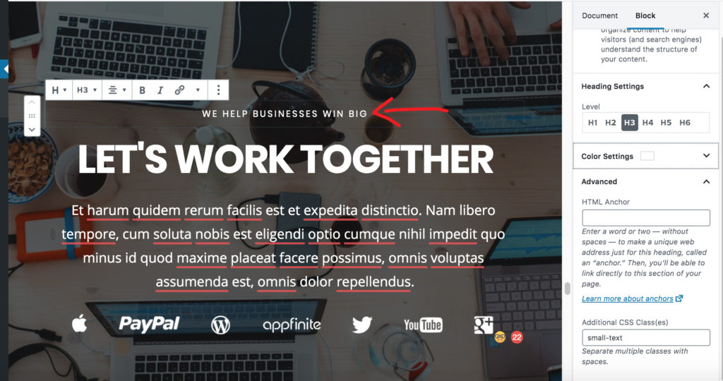
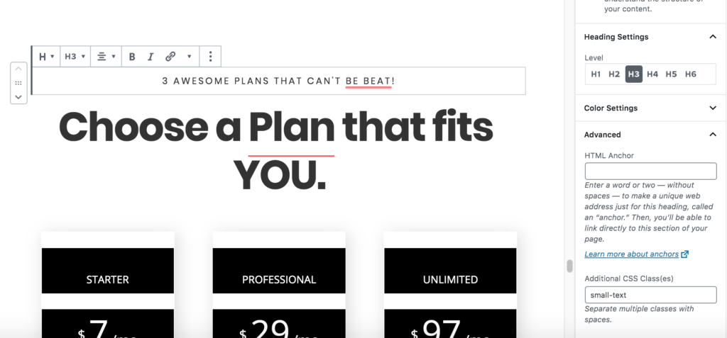
Sub-Heading Block
- Heading Settings
- Level: H3
- Text Alignment: Left aligned
- Color: #ffffff
- Advanced
- Additional CSS Class: Enter sub-heading to apply the theme’s CSS to style the heading.
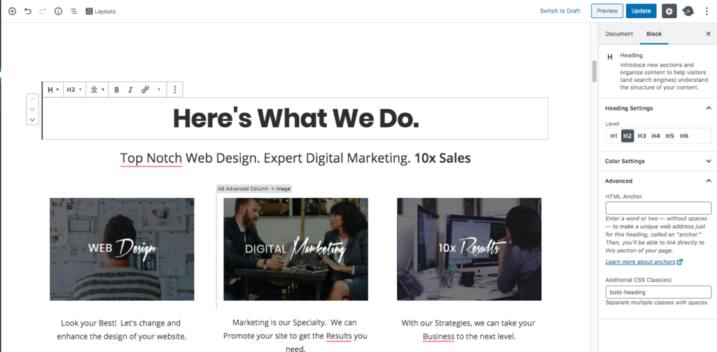
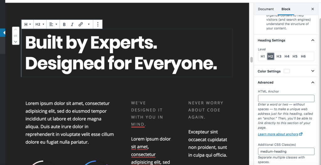
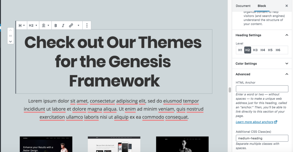
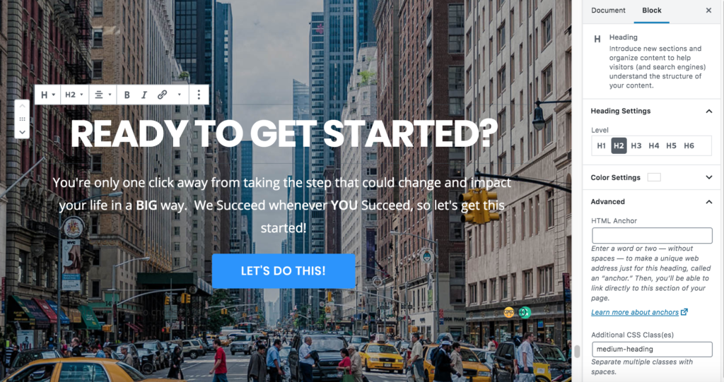
Heading Block
- Heading Settings
- Level: H1
- Text Alignment: Left aligned
- Color: #ffffff
- Advanced
- Additional CSS Class: Enter large-heading to apply the theme’s CSS to style the heading.
Paragraph Block
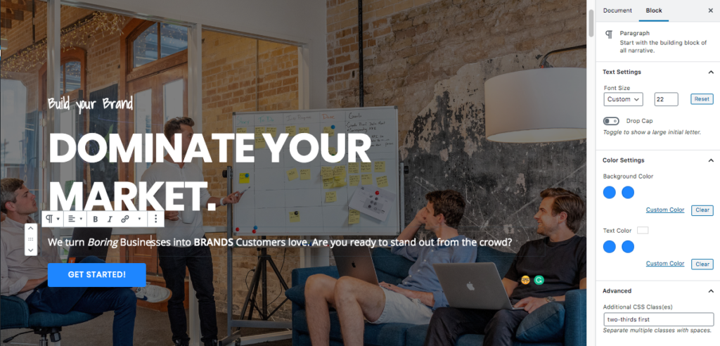
- Text Settings
- Font Size: Custom 22
- Color Settings: The text color is set to #ffffff.
- Advanced
- Additional CSS Class: Enter two-thirds first to apply the theme’s CSS to style the paragraph.
AB Button Block
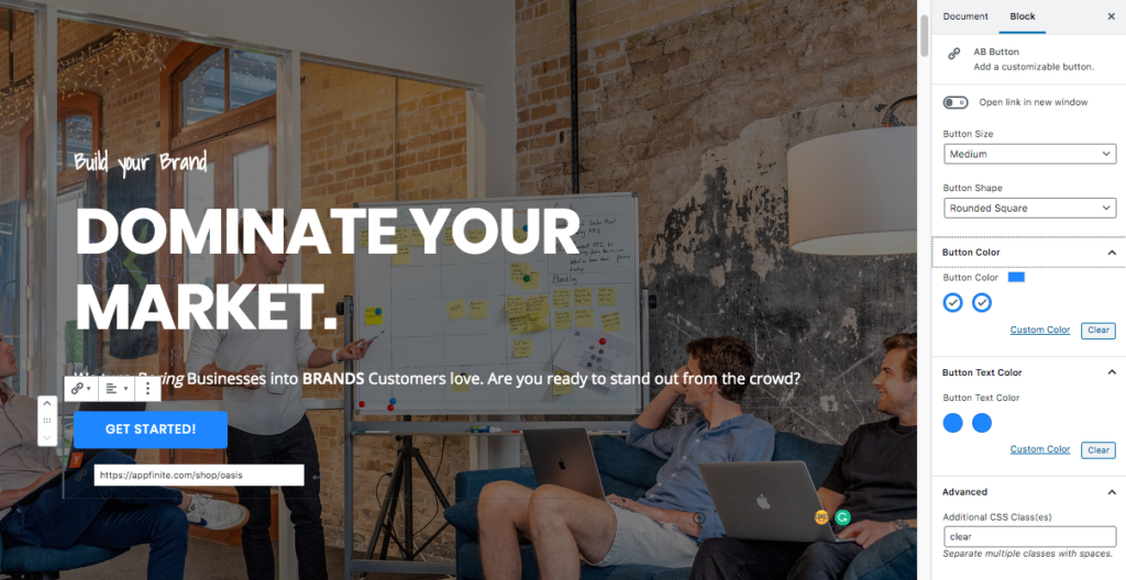
- Button Size: Medium
- Button Shape: Rounded Square.
- Button Color: Default Color
- Advanced
- Additional CSS Class: clear
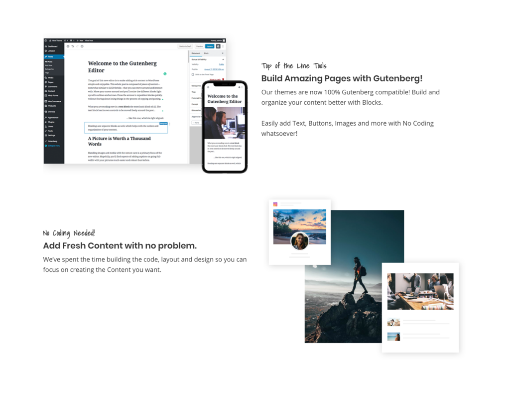
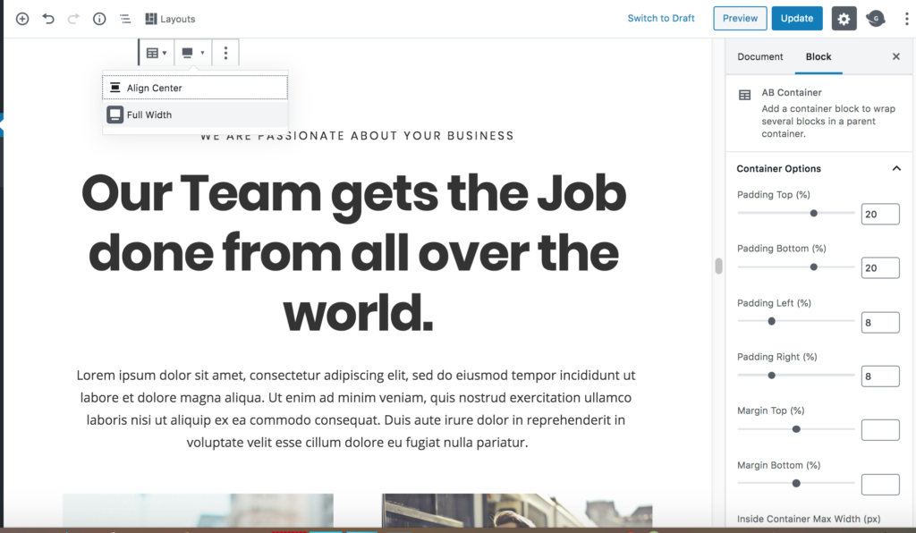
Homepage Section 2
The following blocks are used in this section of the Oasis Theme demo:
- AB Container
- Heading Block
- Paragraph Block
AB Container Block
- Select the Full Width option in the Tool Bar.
- Container Options
- Padding Top: 25
- Padding Bottom: 25
- Padding Left: 8
- Padding Right: 8
- Margin Top: 0
- Margin Bottom: 0
- Inside Container Max Width: 1200
- Background Color: #fffff (Click the Custom Color link to apply this setting.)
Heading Block
- Heading Settings
- Level: H2
- Text Alignment: Center
- Advanced
- Additional CSS Class: Enter bold-heading to apply the theme’s CSS to style the heading.
Paragraph Block
- Text Settings
- Font Size: Custom 30
- Color Settings: The text color is set to the default theme color.
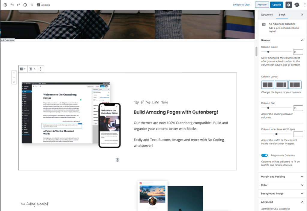
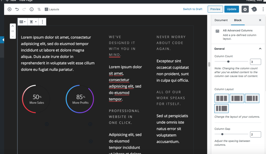
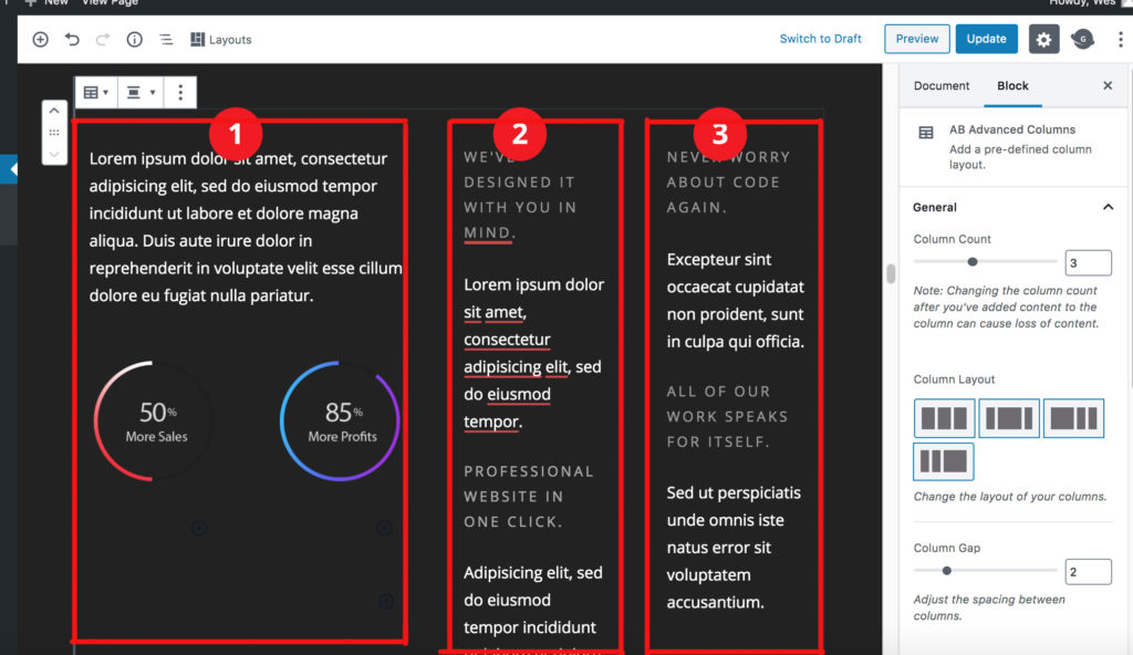
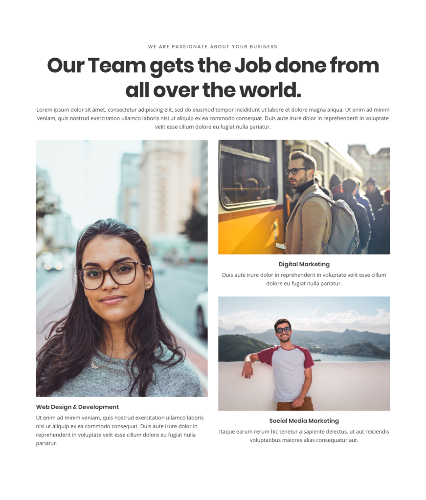
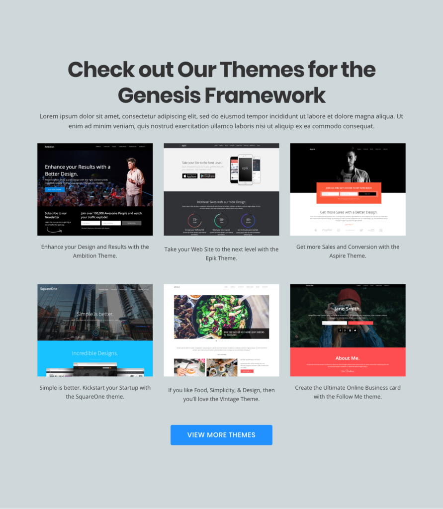
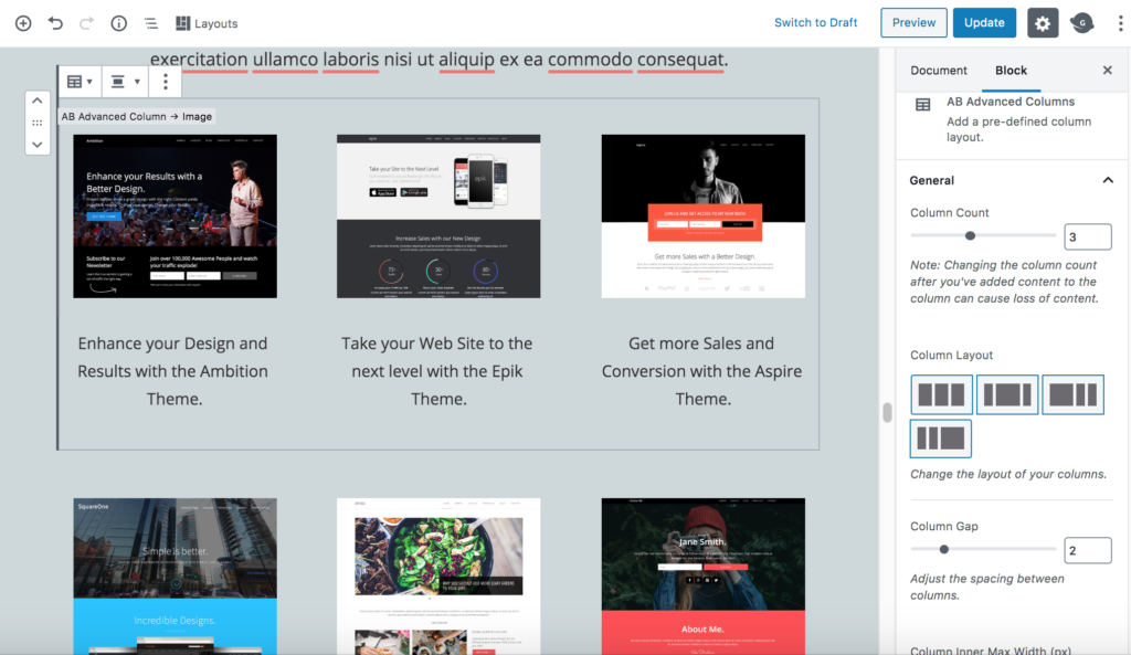
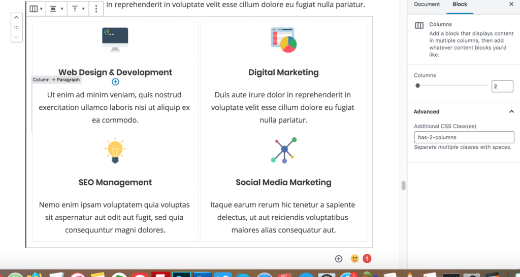
AB Advanced Columns Block
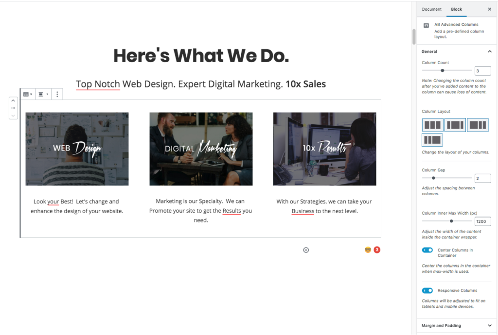
- Column Count: 3
- Column Gap: 3
- Column Inner Max Width: 1200
- Center Columns In Container: Yes
- Responsive Columns: Yes
- Margin Unit: Pixels
- Sync Margin: Yes
- Margin Top/Bottom: 40
- Padding Unit: Pixels
- Sync Padding: No
- Padding:
- Top: 0
- Right: 0
- Bottom: 0
- Left: 0
Image Block
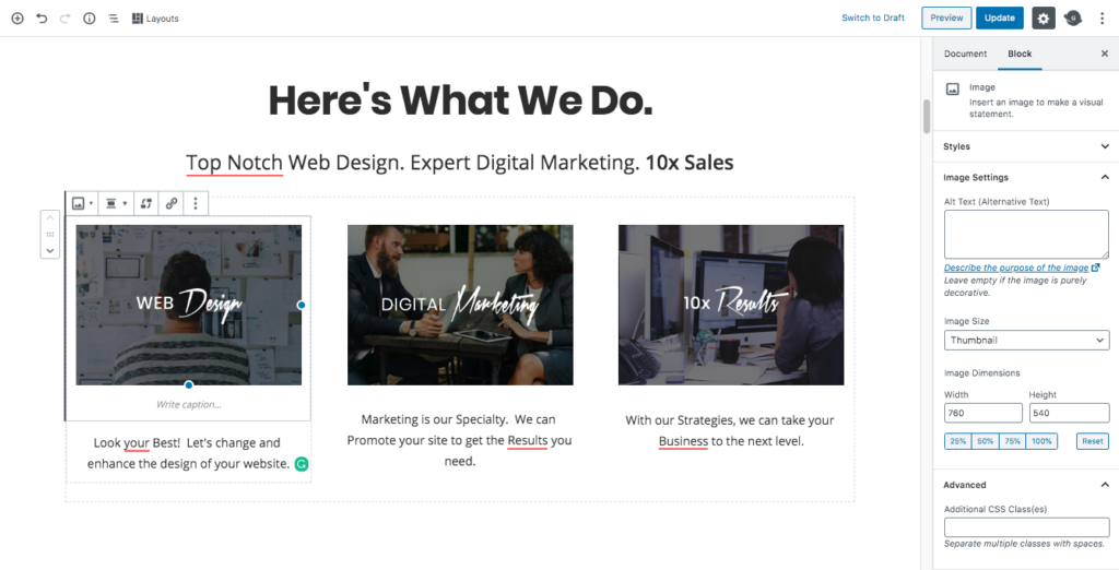
- Styles: Default
- Image Size: Thumbnail
- Width/Height: This can be any size (whichever works best for your image)
Paragraph Block
Font Size: Normal
Column 2 and Column 3:
Repeat the above steps for Columns 2 and 3. There should be an Image Block and a Paragraph Block added in all 3 Columns to replicate the demo.
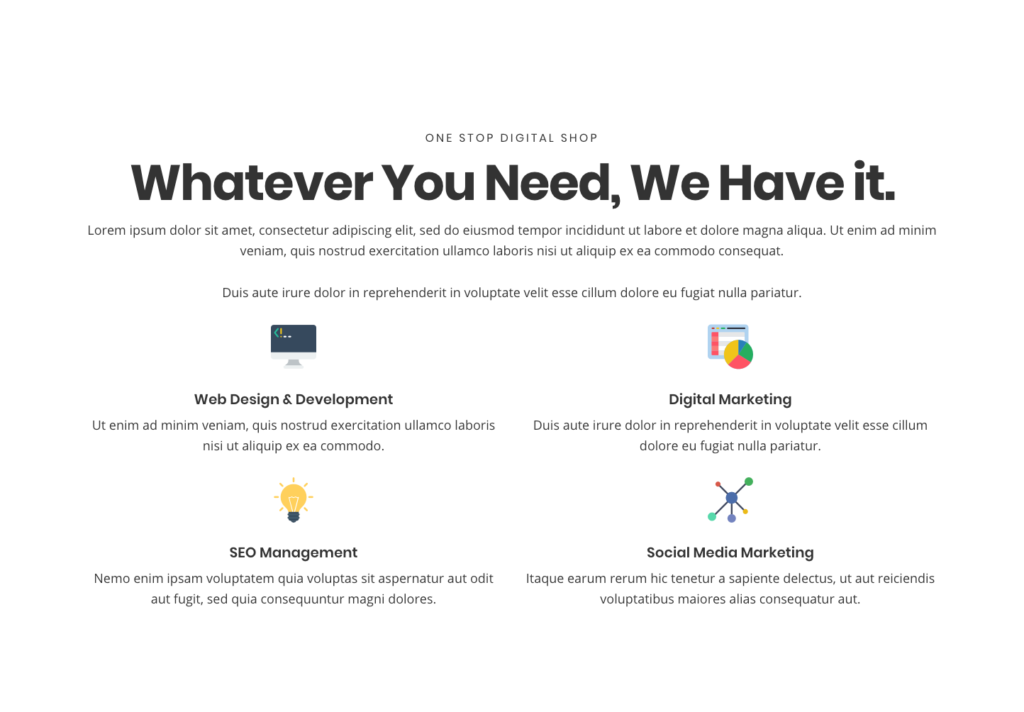
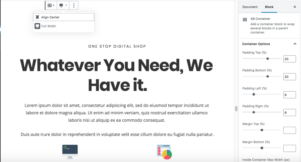
Homepage Section 3

AB Container Block
- Select the Full Width option in the Tool Bar.
- Container Options
- Padding Top: 25
- Padding Bottom: 25
- Padding Left: 8
- Padding Right: 8
- Margin Top: 0
- Margin Bottom: 0
- Inside Container Max Width: 1200
- Background Options
- Image: Click Select Image to change the background image currently being used or Remove to completely remove the background image and just use a solid background color.
- Image Opacity: 50
- Background Color: #000000 (Click the Custom Color link to apply this setting.)
Heading Block
- Heading Settings
- Level: H2
- Text Alignment: Center
- Color: #ffffff
- Advanced
- Additional CSS Class: Enter bold-heading to apply the theme’s CSS to style the heading.
Paragraph Block
- Font Size: 24
- Color: #ffffff
Email Newsletter Block
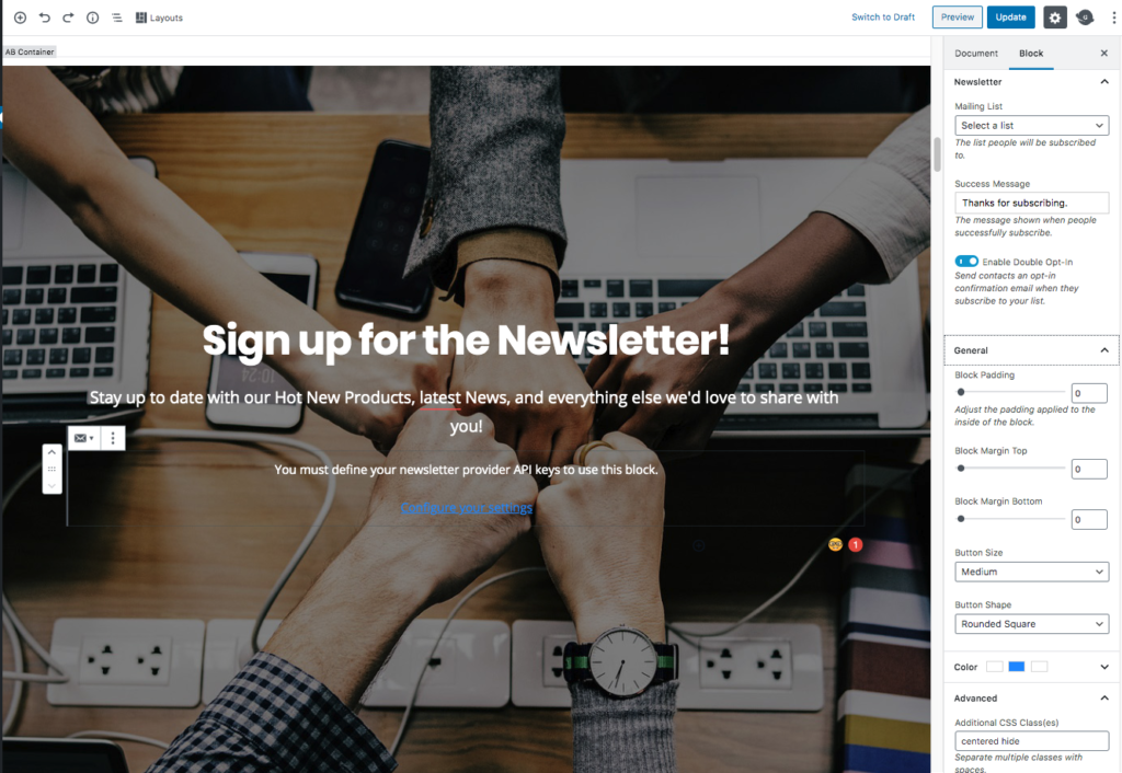
- Mailing List: (Select your List)
- Success Message: Thanks for Subscribing (This can be whatever you wish)
- Block Padding: 0
- Block Margin Top: 0
- Block Margin Bottom: 0
- Button Size: Medium
- Button Shape: Rounded Square
- Button Colors: Default (Or Select your own color)
- Advanced CSS Classes: centered hide (the “hide” class hides the “Email” text from appearing on top of the field. You can add or remove this if you wish)
Homepage Section 4
AB Container Block
- Select the Full-Width option in the Tool Bar.
- Container Options
- Padding Top: 10
- Padding Bottom: 10
- Padding Left: 8
- Padding Right: 8
- Margin Top: 0
- Margin Bottom: 0
- Inside Container Max Width: 1200
- Background Color: #fffff (Click the Custom Color link to apply this setting.)
AB Advanced Columns Block
- Column Count: 2
- Column Gap: 2
- Column Inner Max Width: 1200
- Responsive Columns: Yes
- Margin Unit: Pixels
- Sync Margin: Yes
- Margin Top/Bottom: 0
- Padding Unit: Pixels
- Sync Padding: No
- Padding:
- Top: 0
- Right: 0
- Bottom: 0
- Left: 0
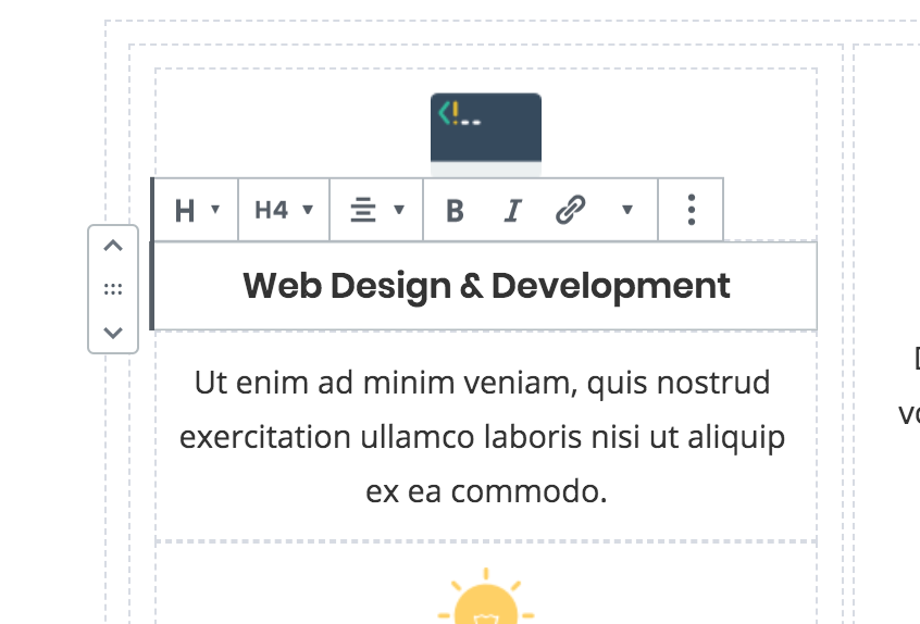
Image Block

Add an image block to the first Column and upload the image or select one from your Media/Library.
Heading Block (for Sub Heading)
- Heading Settings
- Level: H3
- Text Alignment: Left aligned
- Color: Default (#333333)
- Advanced
- Additional CSS Class: Enter sub-heading to apply the theme’s CSS to style the heading.
Heading Block (Main Heading)
- Heading Settings
- Level: H3
- Text Alignment: Left aligned
- Color: Default (#333333)
- Advanced
Paragraph Block
Font Size: Normal (18px)
2nd Column Row:

Repeat the above steps to replicate the demo, but in the 2 row, we have the Text on the left and the image on the right.
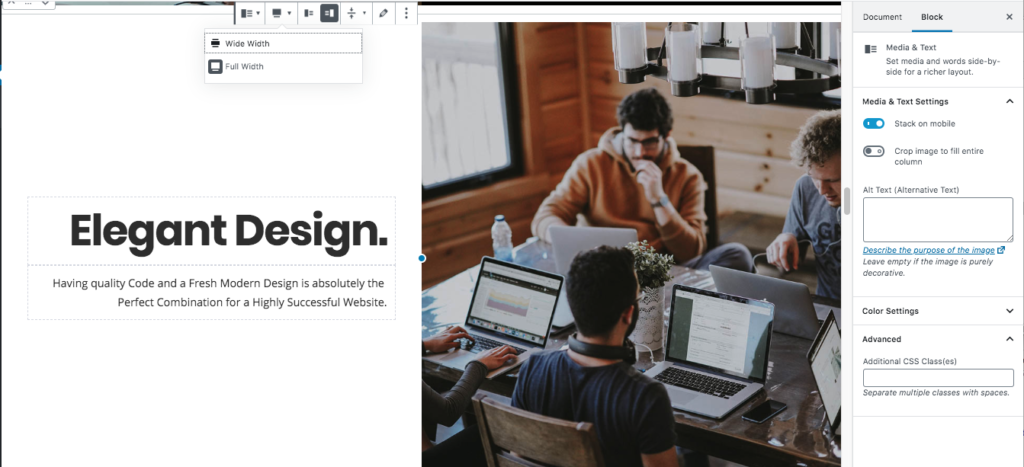
Home Section 5
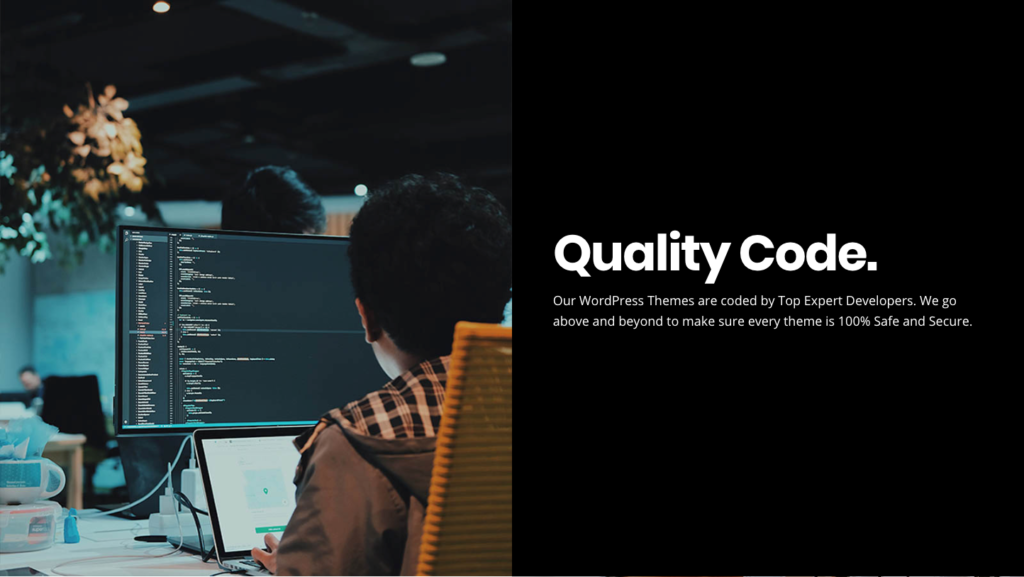
Media & Text Block
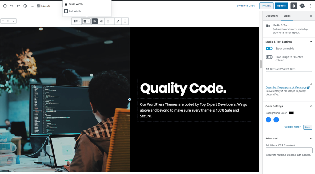
- Alignment: Full-Width (Located in Toolbar)
- Stack on Mobile: Yes
- Background-Color: #000000
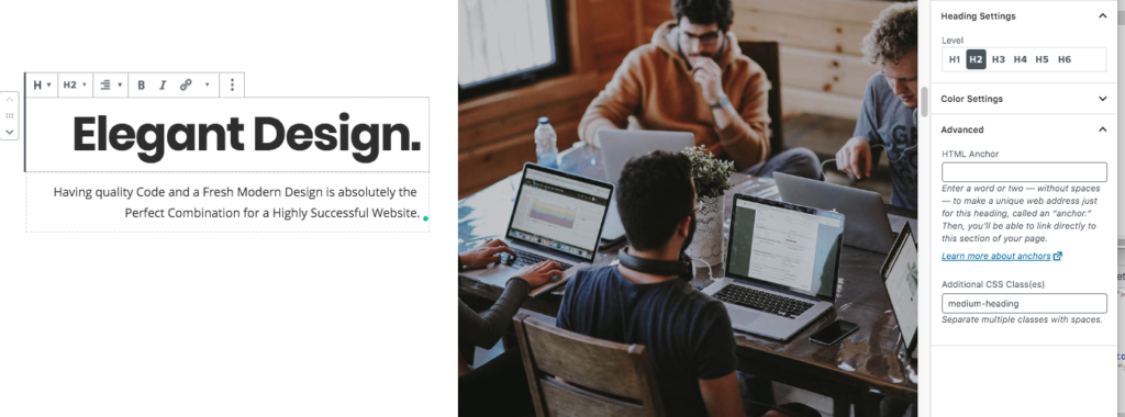
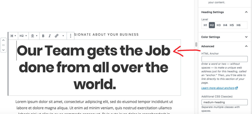
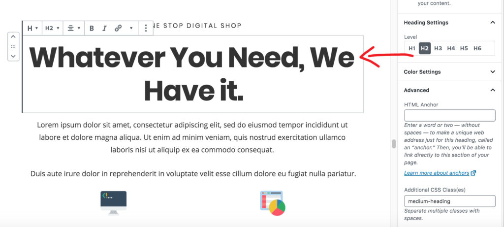
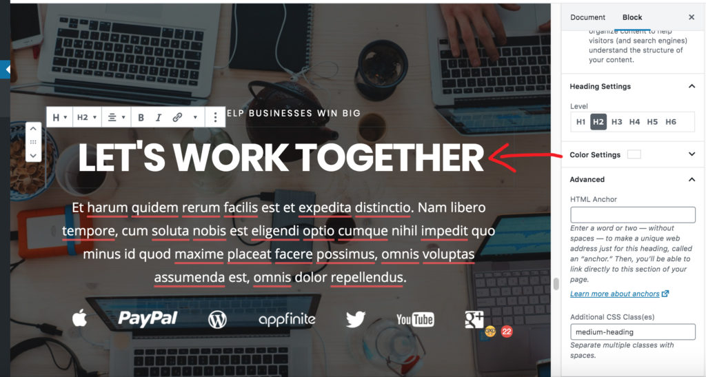
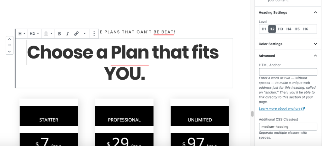
Heading Block

- Heading Settings
- Level: H2
- Text Alignment: Left aligned
- Color: #ffffff
- Advanced
- Additional CSS Class: Enter medium-heading to apply the theme’s CSS to style the heading.
Paragraph Block
Font Size: Normal (18px)
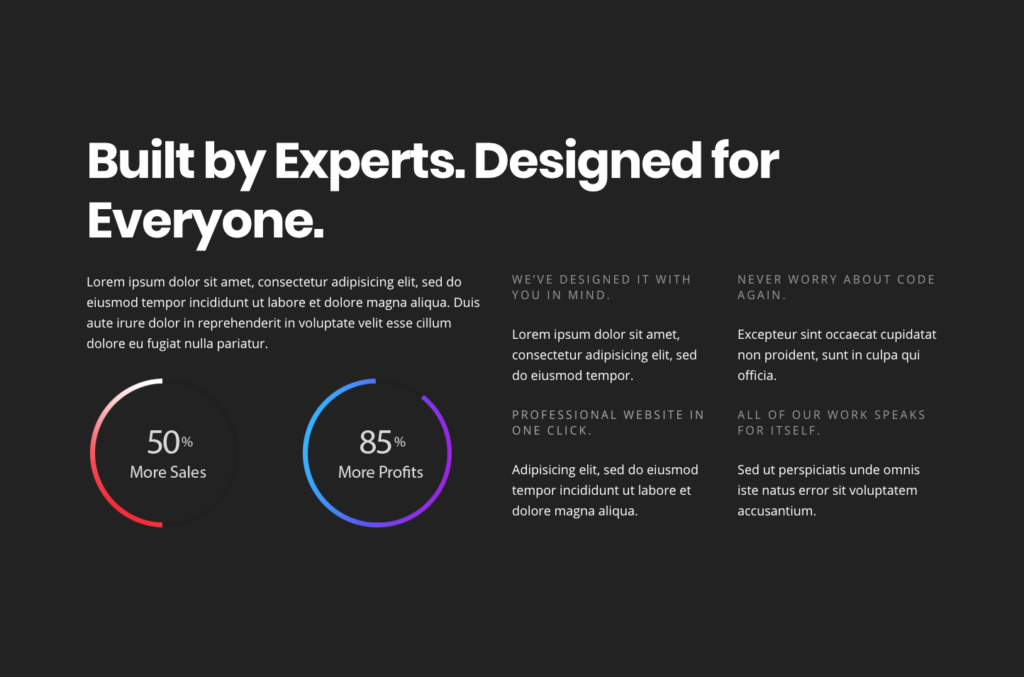
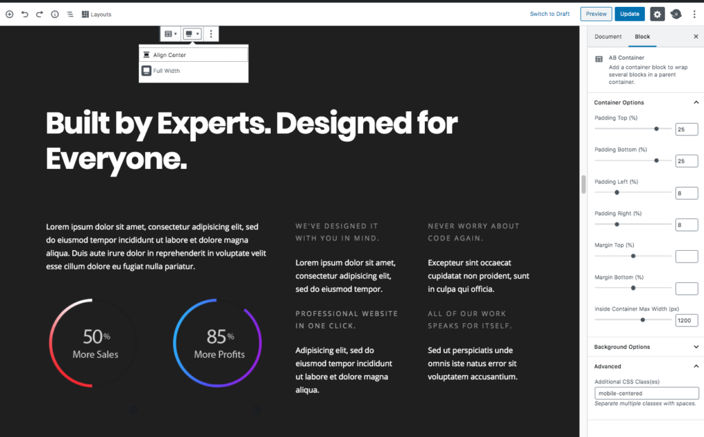
Homepage Section 6
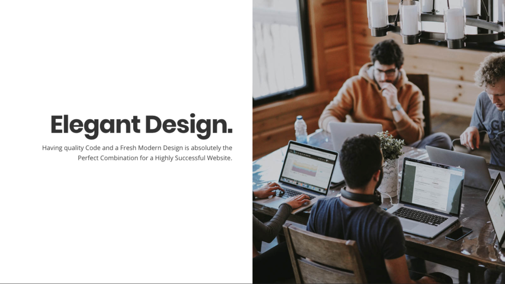
Media & Text Block
- Alignment: Full-Width (Located in Toolbar)
- Stack on Mobile: Yes
- Background-Color: #ffffff
Heading Block
- Heading Settings
- Level: H2
- Text Alignment: Left aligned
- Color: #333333
- Advanced
- Additional CSS Class: Enter medium-heading to apply the theme’s CSS to style the heading.
Paragraph Block
Font Size: Normal (18px)
Home Section 7
AB Container Block
- Select the Full-Width option in the Tool Bar.
- Container Options
- Padding Top: 25
- Padding Bottom: 25
- Padding Left: 8
- Padding Right: 8
- Margin Top: 0
- Margin Bottom: 0
- Inside Container Max Width: 1200
- Background Color: #222222 (Click the Custom Color link to apply this setting.)
Heading Block
- Heading Settings
- Level: H2
- Text Alignment: Left aligned
- Color: #ffffff
- Advanced
- Additional CSS Class: Enter medium-heading to apply the theme’s CSS to style the heading.
Spacer Block
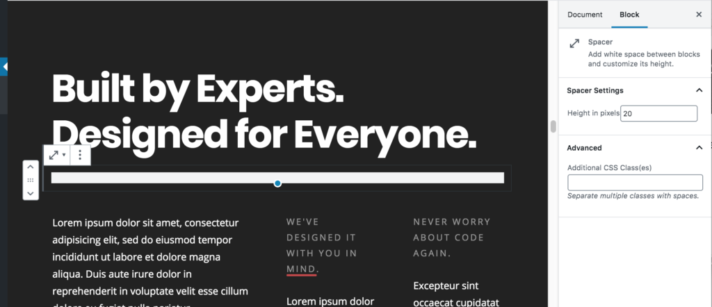
Height in pixels: 20
AB Advanced Columns Block
- Column Count: 3
- Column Layout: 3rd Layout Option
- Column Gap: 2
- Column Inner Max Width: 1200
- Responsive Columns: Yes
- Margin Unit: Pixels
- Sync Margin: Yes
- Margin Top/Bottom: 0
- Padding Unit: Pixels
- Sync Padding: No
- Padding:
- Top: 0
- Right: 0
- Bottom: 0
- Left: 0
1st Column:
Paragraph Block
Font size: Normal (18)
2nd Column:
Paragraph Block (Small Gray Heading Text)
- Font Size: Normal
- Color: #999999
- Advanced: Additional CSS Class: Enter small-text to apply the theme’s CSS to style the heading.
Paragraph Block
- Font Size: Normal
- Advanced: Additional CSS Class: Enter small-text to apply the theme’s CSS to style the heading.
3rd Column:
Paragraph Block (Small Gray Heading Text)
- Font Size: Normal
- Color: #999999
- Advanced: Additional CSS Class: Enter small-text to apply the theme’s CSS to style the heading.
Paragraph Block
- Font Size: Normal
- Advanced: Additional CSS Class: Enter small-text to apply the theme’s CSS to style the heading.
Homepage Section 8
AB Container Block
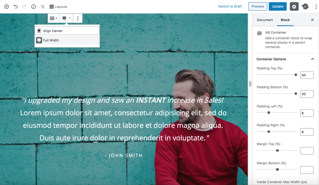
- Select the Full-Width option in the Tool Bar.
- Container Options
- Padding Top: 30
- Padding Bottom: 30
- Padding Left: 8
- Padding Right: 8
- Margin Top: 0
- Margin Bottom: 0
- Inside Container Max Width: 1200
- Background Options
- Image: Click Select Image to change the background image currently being used or Remove to completely remove the background image and just use a solid background color.
- Image Opacity: 70
- Background Color: #000000 (Click the Custom Color link to apply this setting.)
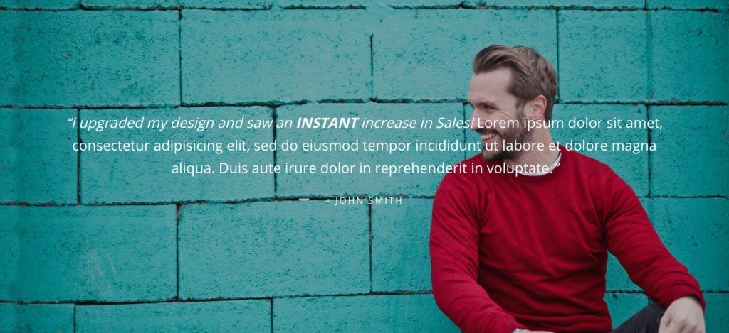
Paragraph Block
Font Size: 28
Homepage Section 9
AB Container Block
- Select the Full-Width option in the Tool Bar.
- Container Options
- Padding Top: 20
- Padding Bottom: 20
- Padding Left: 8
- Padding Right: 8
- Margin Top: 0
- Margin Bottom: 0
- Inside Container Max Width: 1200
- Background Color: #ffffff (Click the Custom Color link to apply this setting.)
Heading Block (Sub Heading)
- Heading Settings
- Level: H3
- Text Alignment: Center
- Color: #333333
- Advanced
- Additional CSS Class: Enter small-text to apply the theme’s CSS to style the heading.
Heading Block (Main Heading)
- Heading Settings
- Level: H2
- Text Alignment: Center
- Color: #333333
- Advanced
- Additional CSS Class: Enter medium-heading to apply the theme’s CSS to style the heading.
Homepage Section 10
AB Container Block
- Select the Full-Width option in the Tool Bar.
- Container Options
- Padding Top: 25
- Padding Bottom: 25
- Padding Left: 8
- Padding Right: 8
- Margin Top: 0
- Margin Bottom: 0
- Inside Container Max Width: 1200
- Background Color: #ced7da (Click the Custom Color link to apply this setting.)
Heading Block
- Heading Settings
- Level: H2
- Text Alignment: Center
- Color: #333333
- Advanced
- Additional CSS Class: Enter medium-heading to apply the theme’s CSS to style the heading.
Paragraph Block
Font Size: Normal (18)
AB Advanced Columns Block
- Column Count: 3
- Column Gap: 2
- Column Inner Max Width: 1200
- Center Columns In Container: Yes
- Responsive Columns: Yes
- Margin Unit: Pixels
- Sync Margin: Yes
- Margin Top/Bottom: 40
- Padding Unit: Pixels
- Sync Padding: No
- Padding:
- Top: 0
- Right: 0
- Bottom: 0
- Left: 0
Column 1
Image Block

Paragraph Block
Font Size: Normal (18)
Text Alignment: Center
Repeat the above steps for Columns 2 and 3
AB Button Block
- Button Size: Medium
- Button Shape: Rounded Square.
- Button Color: Default Color
- Advanced
- Additional CSS Class: clear
Homepage Section 11
AB Container Block
- Select the Full-Width option in the Tool Bar.
- Container Options
- Padding Top: 20
- Padding Bottom: 20
- Padding Left: 8
- Padding Right: 8
- Margin Top: 0
- Margin Bottom: 0
- Inside Container Max Width: 1200
- Background Color: #ffffff (Click the Custom Color link to apply this setting)
Heading Block (Sub Heading)
- Heading Settings
- Level: H3
- Text Alignment: Center
- Color: #333333
- Advanced
- Additional CSS Class: Enter small-text to apply the theme’s CSS to style the heading.
Heading Block (Main Heading)
- Heading Settings
- Level: H2
- Text Alignment: Center
- Color: #333333
- Advanced
- Additional CSS Class: Enter medium-heading to apply the theme’s CSS to style the heading.
Paragraph Block
Font Size: Normal (18)
Text Alignment: Center
Columns Block
Columns: 2
Column 1
Image Block

Heading Block
- Heading Settings
- Level: H4
- Text Alignment: Center
- Color: #333333
Repeat the above steps for Column 2
Homepage Section 12
AB Container Block
- Select the Full Width option in the Tool Bar.
- Container Options
- Padding Top: 30
- Padding Bottom: 30
- Padding Left: 8
- Padding Right: 8
- Margin Top: 0
- Margin Bottom: 0
- Inside Container Max Width: 1200
- Background Options
- Image: Click Select Image to change the background image currently being used or Remove to completely remove the background image and just use a solid background color.
- Image Opacity: 50
- Background Color: #000000 (Click the Custom Color link to apply this setting.)
Sub-Heading Block
- Heading Settings
- Level: H3
- Text Alignment: Left aligned
- Color: #ffffff
- Advanced
- Additional CSS Class: Enter small-text to apply the theme’s CSS to style the heading.
Heading Block
- Heading Settings
- Level: H2
- Text Alignment: Left aligned
- Color: #ffffff
- Advanced
- Additional CSS Class: Enter medium-heading to apply the theme’s CSS to style the heading.
Paragraph Block
Font Size: Normal
Text-Alignment: Center
Homepage Section 13
AB Container Block
- Select the Full-Width option in the Tool Bar.
- Container Options
- Padding Top: 25
- Padding Bottom: 25
- Padding Left: 8
- Padding Right: 8
- Margin Top: 0
- Margin Bottom: 0
- Inside Container Max Width: 1200
- Background Color: #ffffff (Click the Custom Color link to apply this setting)
Heading Block (Sub Heading)
- Heading Settings
- Level: H3
- Text Alignment: Center
- Color: #333333
- Advanced
- Additional CSS Class: Enter small-text to apply the theme’s CSS to style the heading.
Heading Block (Main Heading)
- Heading Settings
- Level: H2
- Text Alignment: Center
- Color: #333333
- Advanced
- Additional CSS Class: Enter medium-heading to apply the theme’s CSS to style the heading.
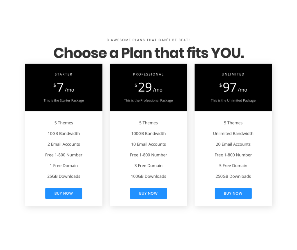
AB Pricing Block
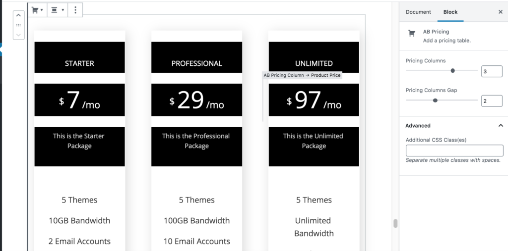
- Pricing Columns: 3
- Pricing Columns Gap: 2
Pricing Title Block
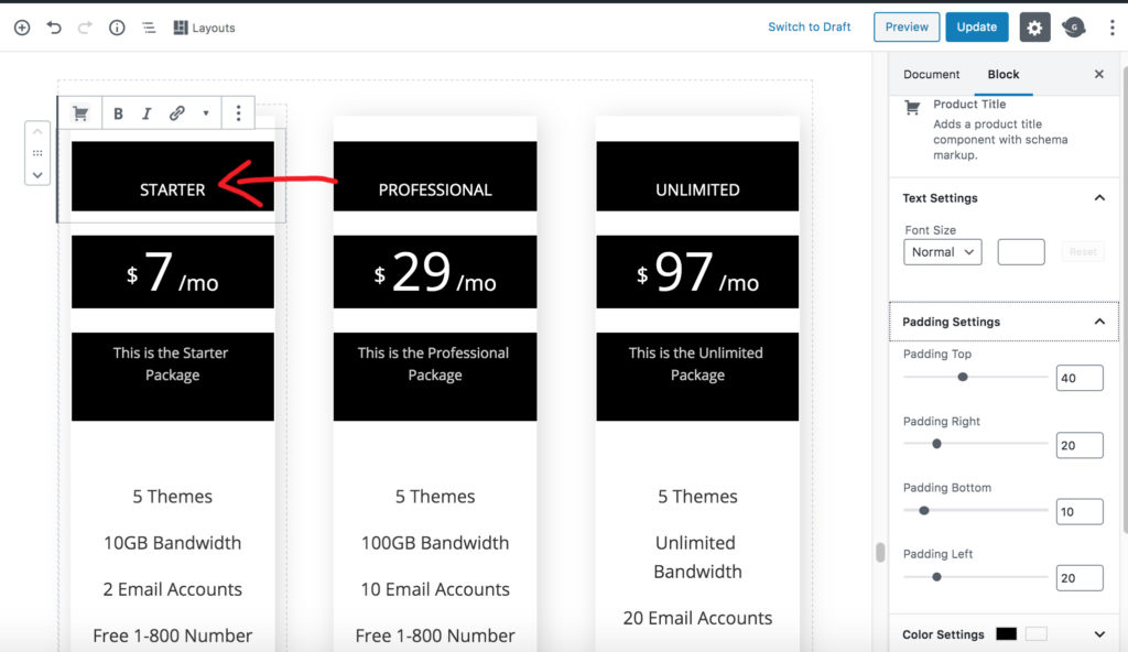
- Font Size: Normal (18)
- Padding Top: 40
- Padding Right: 20
- Padding Bottom: 10
- Padding Left: 20
- Background Color: #000000
- Color: #ffffff
- AdvancedAdditional CSS Class: Enter small-text to apply the theme’s CSS to style the heading.
AB Product Price Block
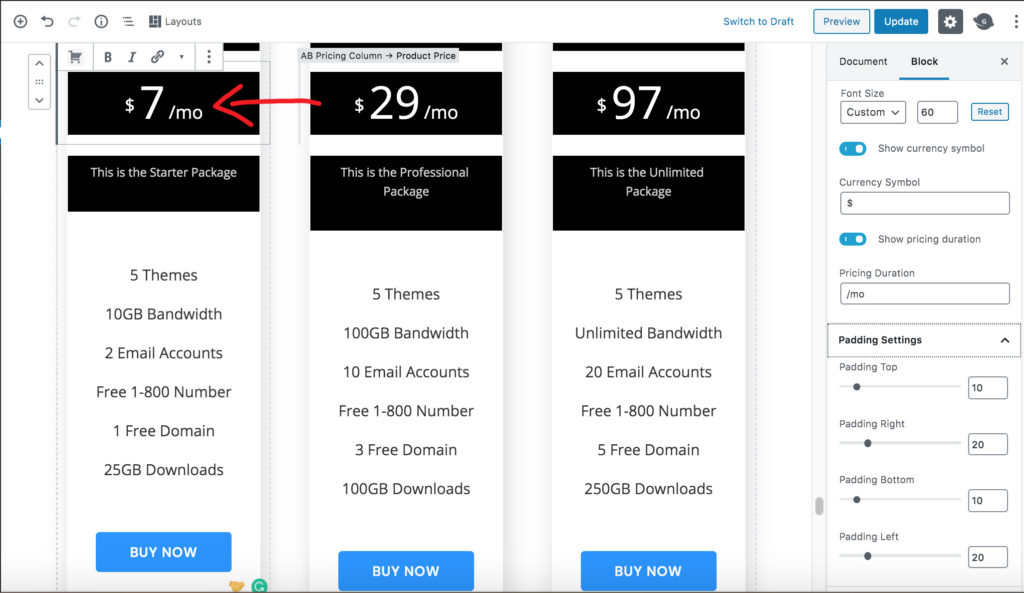
- Font Size: Custom (60)
- Padding Top: 10
- Padding Right: 20
- Padding Bottom: 10
- Padding Left: 20
- Background Color: #000000
- Color: #ffffff
AB Pricing Subtitle
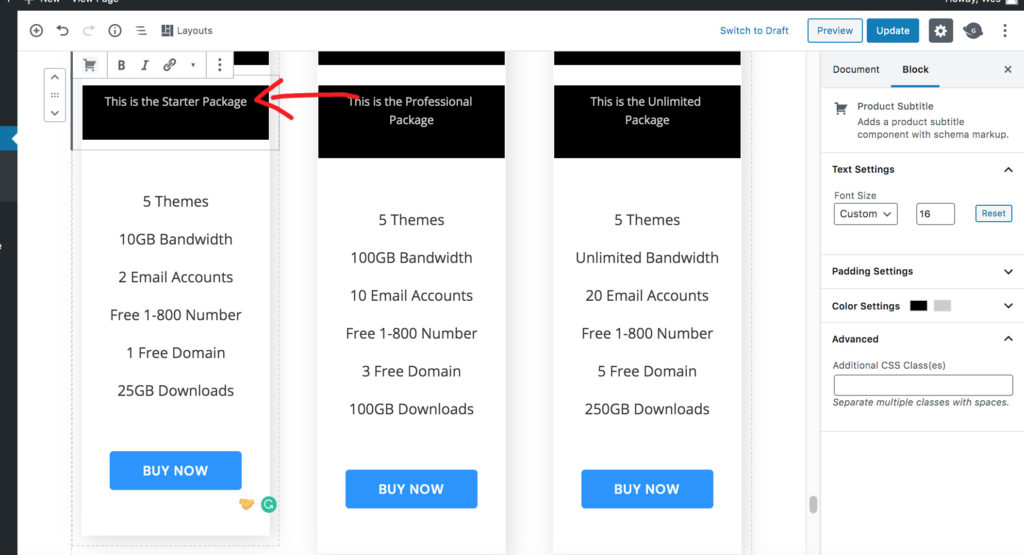
- Font Size: Custom (16)
- Padding Top: 10
- Padding Right: 20
- Padding Bottom: 40
- Padding Left: 20
- Baackground Color: #000000
Homepage Section 14
AB Container Block
- Select the Full Width option in the Tool Bar.
- Container Options
- Padding Top: 25
- Padding Bottom: 25
- Padding Left: 8
- Padding Right: 8
- Margin Top: 0
- Margin Bottom: 0
- Inside Container Max Width: 1200
- Background Options
- Image: Click Select Image to change the background image currently being used or Remove to completely remove the background image and just use a solid background color.
- Image Opacity: 50
- Background Color: #000000 (Click the Custom Color link to apply this setting.)
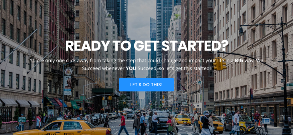
Heading Block
- Heading Settings
- Level: H2
- Text Alignment: Left aligned
- Color: #ffffff
- Advanced
- Additional CSS Class: Enter medium-heading to apply the theme’s CSS to style the heading.
Paragraph Block
Font Size: Normal
Text-Alignment: Center